Tom Sexton Associates Furniture
Challenge
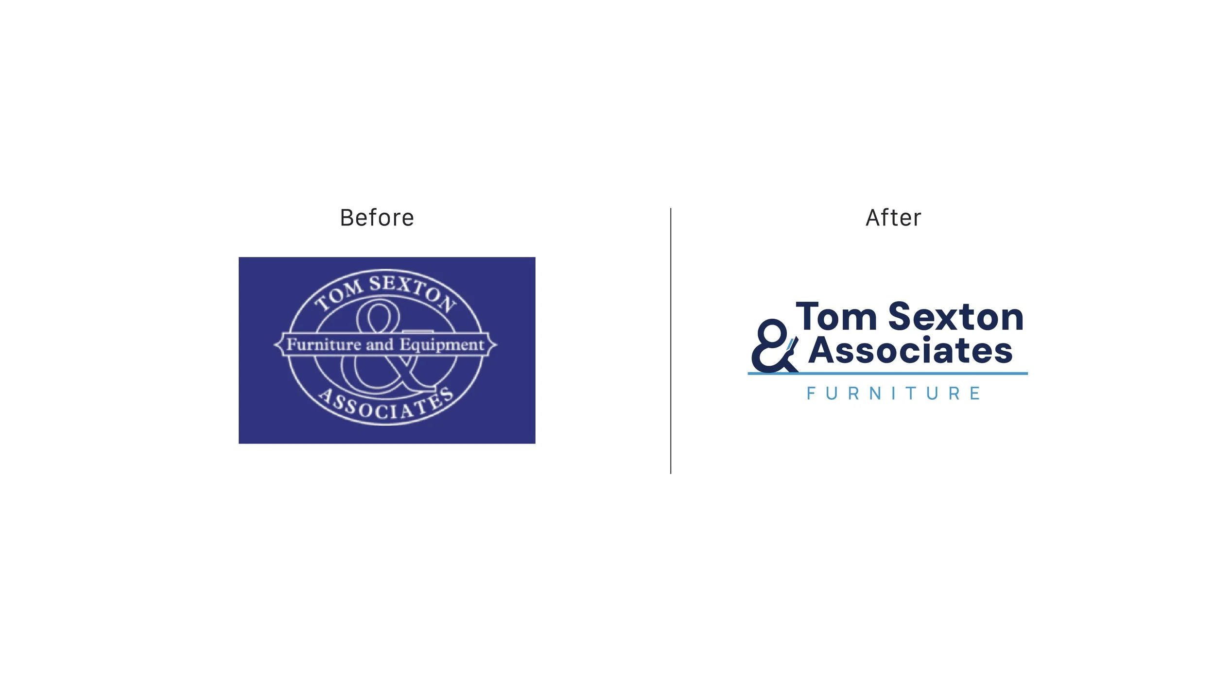
Tom Sexton & Associates Furniture and Equipment has a profitable 25+ year legacy, but its name and identity read more like a law firm than a modern furniture partner. The brand needed to feel current (without alienating loyal K–12 and office customers), clarify what the company actually does, and work seamlessly across today’s marketing touchpoints—web, social, apparel, and print—while setting the stage for growth into higher ed and other sectors.
The new owners of Tom Sexton Associates are building what’s next—growing in both learning and work environments—without losing what made TSA trusted in the first place.
Solution
This refresh honors Tom Sexton’s legacy and the reputation he spent decades earning, while making the brand feel clearer, more modern, and unmistakably rooted in the furniture world.
At the heart of the new mark is a humanized ampersand that subtly becomes a reader—a quiet symbol of what TSA believes: the right spaces (and the right furniture) empower people to learn, focus, and thrive. And that belief is personal.
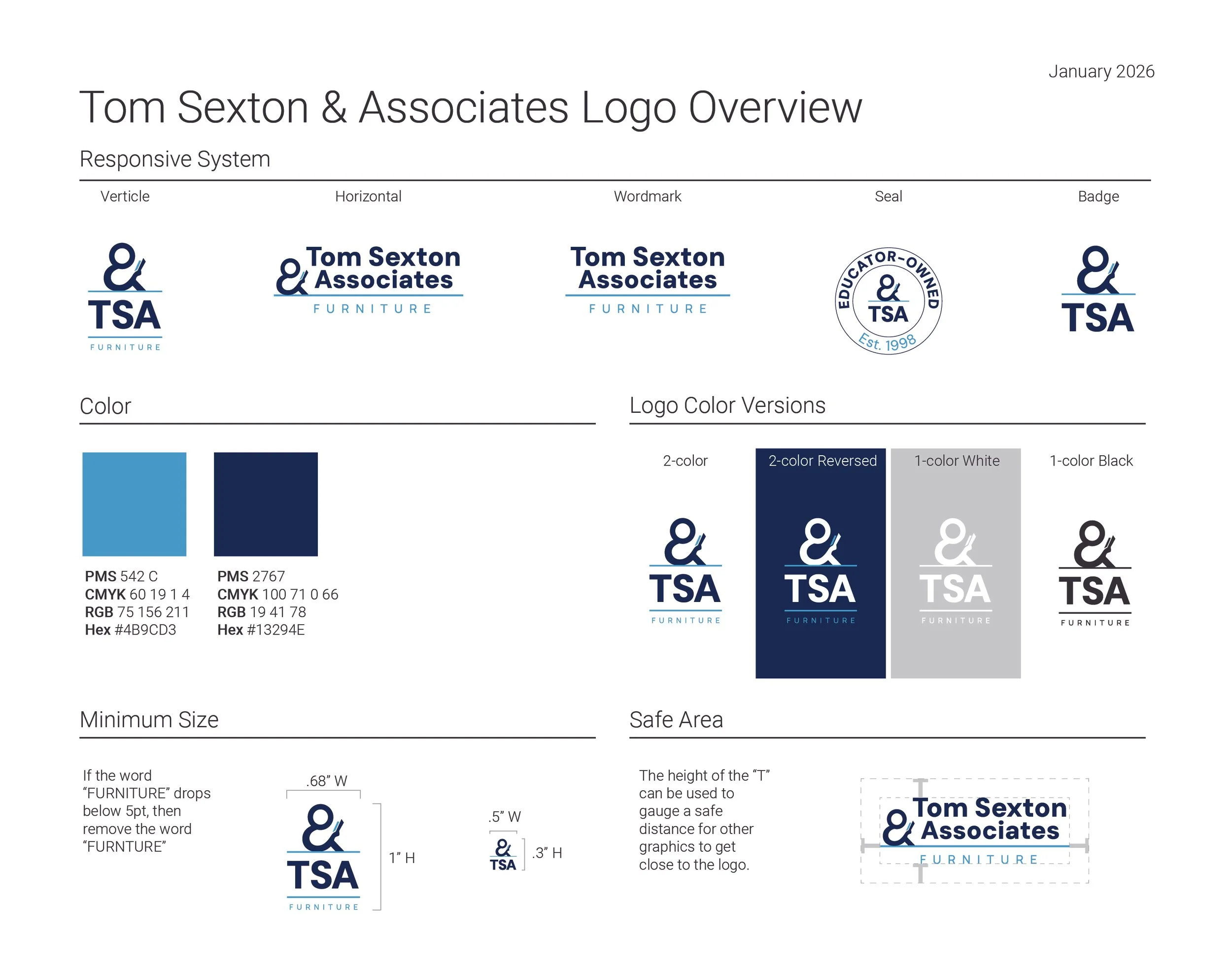
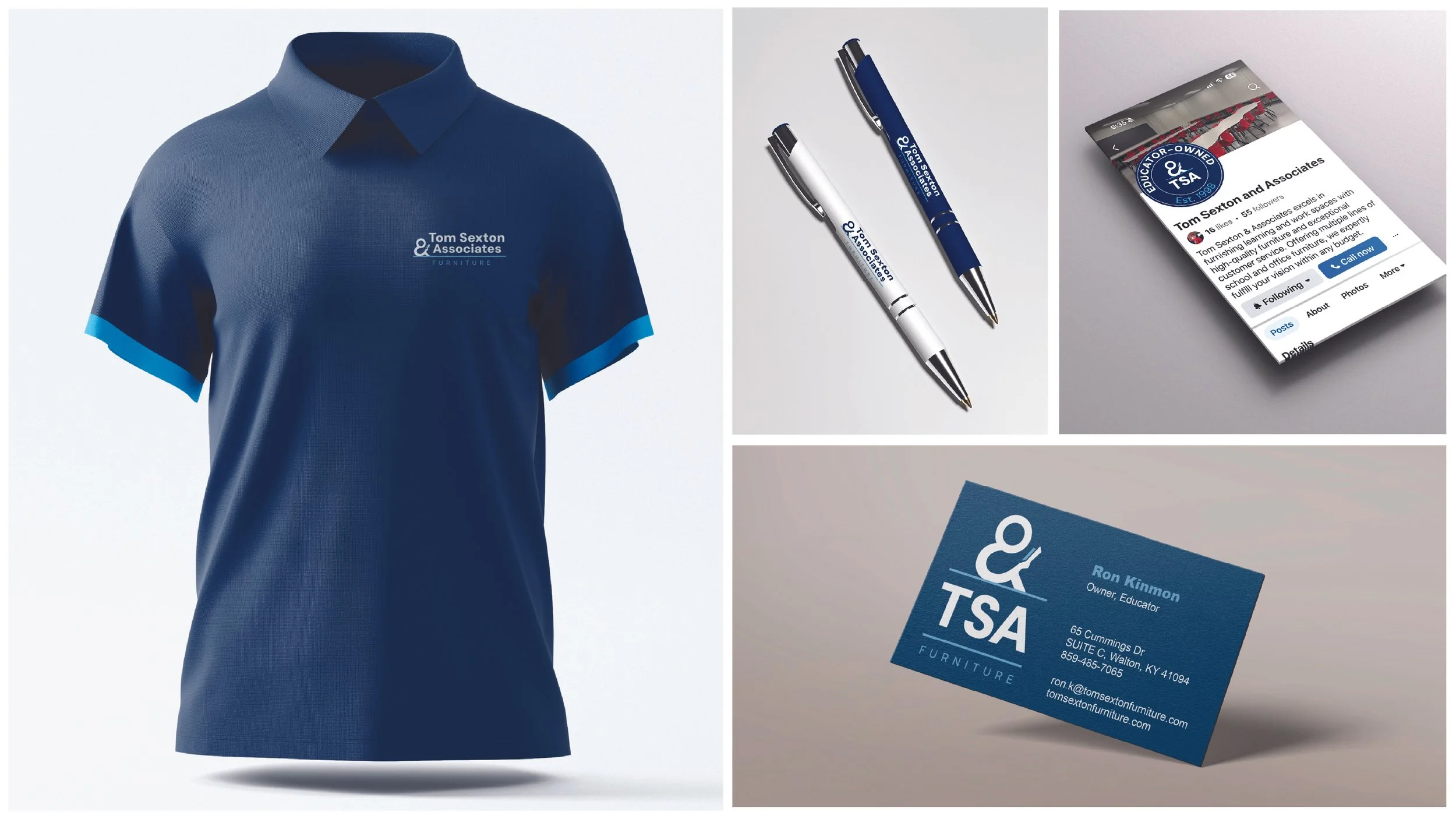
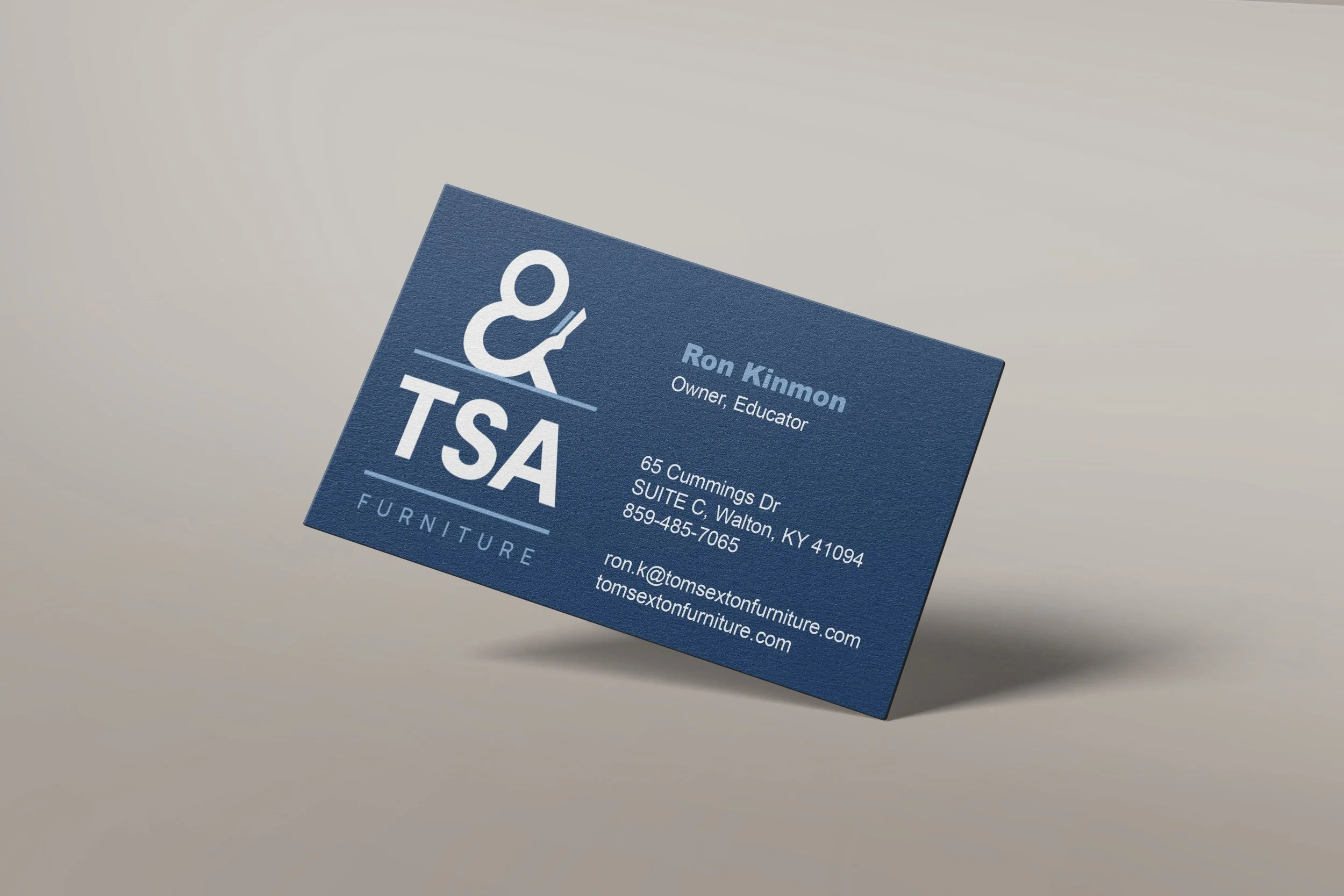
Evolved responsive logo system with TSA as a primary shorthand mark using a refreshed color direction. The logo suite is ready to be deployed across website, shirts, business cards, and social media, to support a gradual phase-in strategy.
Results
A modernized, furniture-forward brand presence that preserves legacy while making the offer instantly obvious—reducing the need for explanation and increasing confidence in sales conversations. The new system provides a clear, adaptable identity for digital and print, strengthens differentiation in a competitive market, and positions the company for expansion beyond its core K–12 and office audience.