Pack Pack Pals
Challenge
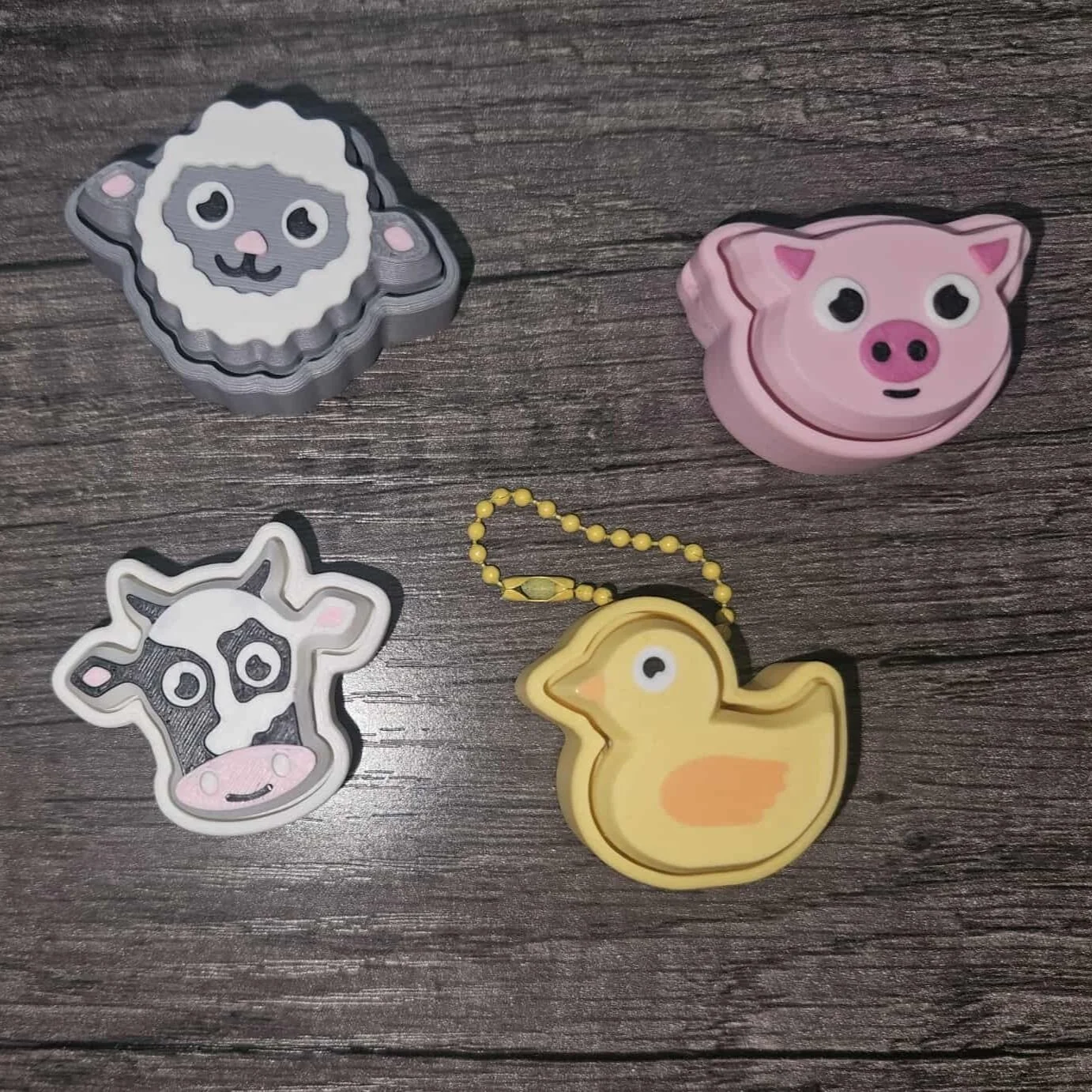
A new business owner reached out to develop a logo for her venture—Pack Pack Pals—a playful brand of 3D-printed animal charms, fidget toys, and compact travel games designed to clip onto backpacks or slip into pockets and go wherever kids go. After my client experimenting with AI-generated logos that didn’t quite capture the brand’s personality, she needed a creative partner who could turn ideas into something lovable, lively, and real.
Solution
We started by reviewing the AI-generated logos to identify what missed the mark, then shifted to designing concepts that would appeal to both kids and parents. I presented three black-and-white logo options focused on charm, collectibility, and portability.
After the client chose a direction, I developed three colorways with formulas for consistent print and digital use. I also provided stacked, horizontal, and monogram logo versions tailored for DIY tools like Canva.
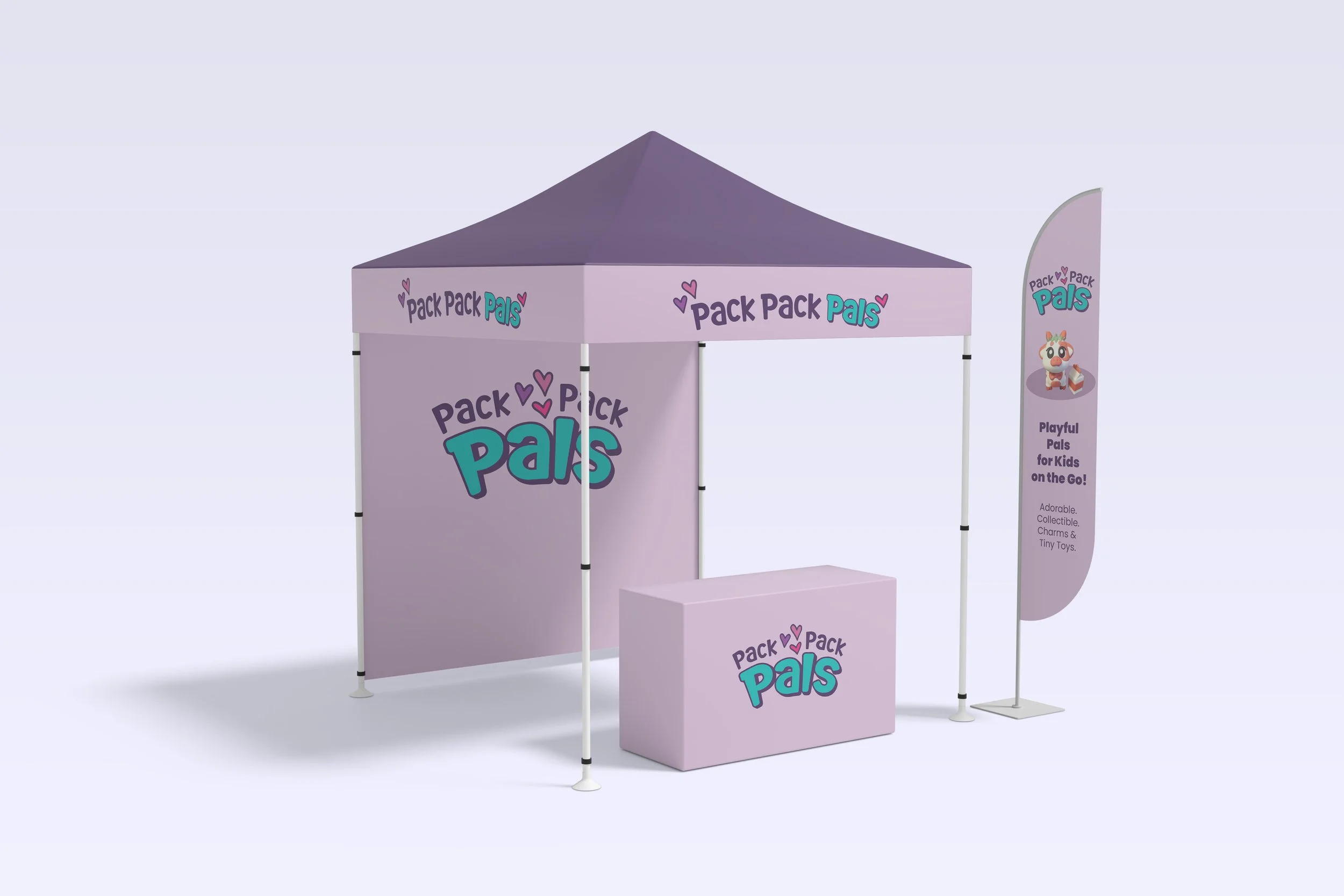
To bring the brand to life, I created mockups of a shopping bag, T-shirt, tent sign, and social post—showing the logo’s versatility across real-world applications.
Results
Within a week, Pack Pack Pals had a polished logo system, defined color palette, and launch-ready logo variations. Days later, the client had built her own website, printed banners, launched a Facebook page, and started planning her first craft fairs. Her tiny pals are already packed and ready to go—ready to tag along in pockets, backpacks, or wherever kids explore.
My client provided some photos of her products and 2 AI generated logos.
This was our starting point to discuss more her vision.


The Creative Process
Round 1: Black and white logo concepts.
Round 2: Exploring color with the chosen logo.
Round 3: Production and testing usability and flexibility.
Concept 1A: Playful Precision. This logo explores the visual language of 3D printing with stylized linework and dot motifs that echo the layering process. The custom type treatment gives each letter its own charm—especially the “A,” whose curved leg subtly mimics a wagging tail, hinting at movement and personality. It’s bold, graphic, and flexible.
Concept 1B: Sweet & Collectible. Designed to evoke affection and collectibility, this version uses a chunky, rounded, cut-out style font reminiscent of the client’s 3D-printed designs. Three hearts nestled between the words emphasize the love kids feel for their favorite trinkets and toys.
Concept 1C: Iconic & Imaginative. This concept centers on a single standout character. After learning that the flamingo was the client’s favorite, I built it directly into the logo—transforming the “l” in Pals into one of the bird’s legs. The circular lockup and clean lines offer a modern badge-like feel, ideal for stickers, tags, or social icons.
Playful and punchy with a modern, gender-neutral vibe.
Bold, bright, and energetic—designed to stand out instantly.
Refined but still vibrant combo that balances whimsy with warmth.
-
![]()
Dream it.
-
![]()
Build it.
-
![]()
Share it.
-
![]()
Sell it.