The ION Center
for Violence Prevention

Challenge
The Women’s Crisis Center realized their name and branding no longer reflected their evolving vision. The name focused too much on “crisis” and the center’s main focus was prevention. The colors, although are in line with national awareness for Domestic Violence and Sexual Assault meant that the brand wasn’t standing out. Despite hiring an agency for a new name and logo, they struggled to embrace and transition the new identity to the market.
Solution
I worked with their leadership to bring the brand to life by grounding their design in strategy, building a strong foundation, and positioning the new logo as the organization’s core identity in a way that breathed new life into the entire center.
Results
After finalizing the strategy, I planned a strategic 2-year transition. The staff fully embraced the rebrand, and stakeholders gained clearer insights into the ION Center’s mission. The brand has seamlessly moved through a major rebrand & strategic transition.

Before

After


Giving Meaning to a Name
The name had been created leaning on the scientific meaning of the word with the concept of “creating change”. But, the brand lacked emotion and something fo the staff to rally behind. By shifting the meaning of the name to be anchored by it’s use as a suffix, denoting action not only resonated with staff but it also was the origin of the brand foundation and gave the staff a memorable way to explain the name and branding changes.
“ION is a part of everything we do.”

Bringing a brand’s foundation to life
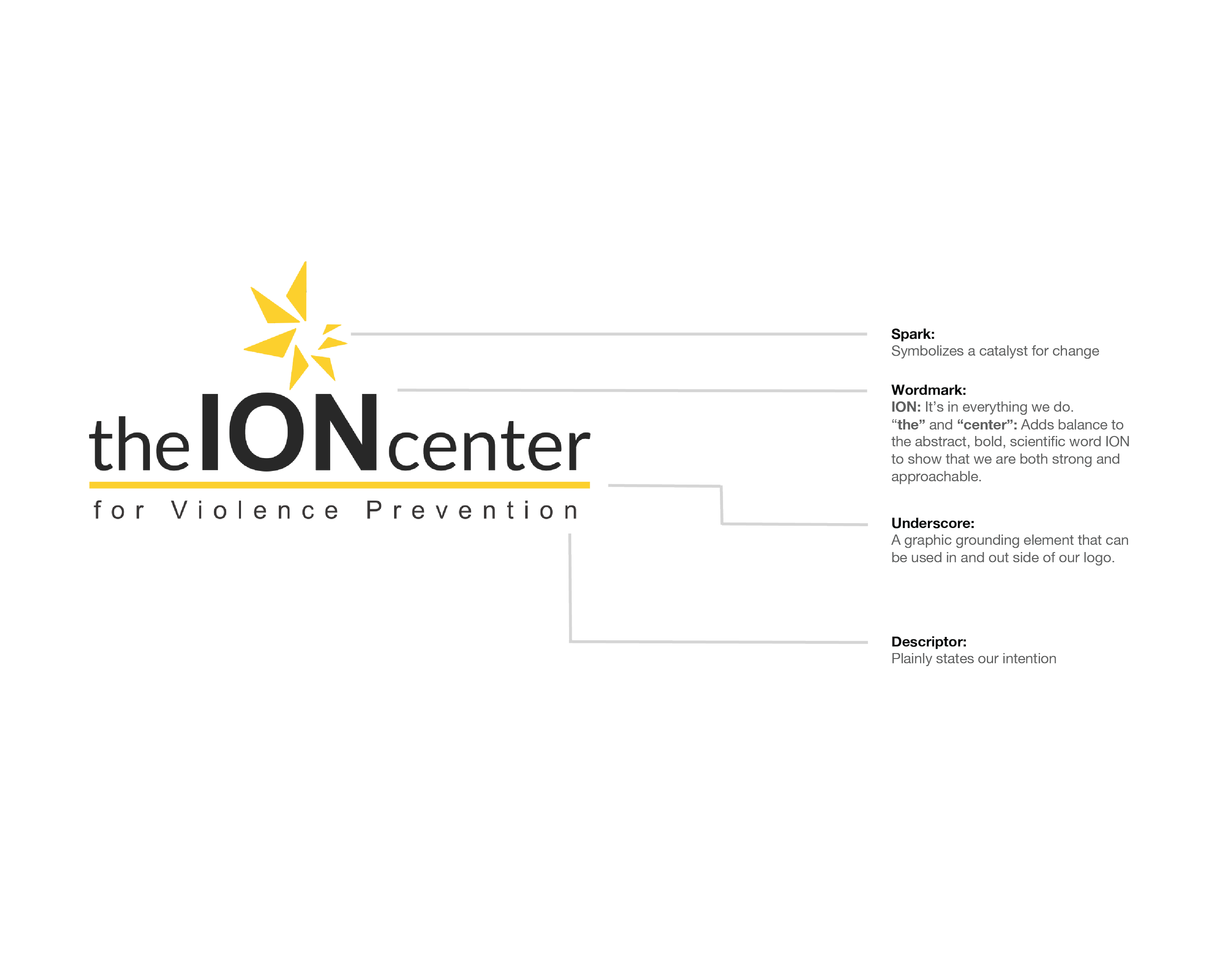
The ION Center inspires a path forward. The logos icon—a spark— symbolizes the brand’s role as a catalyst for change.
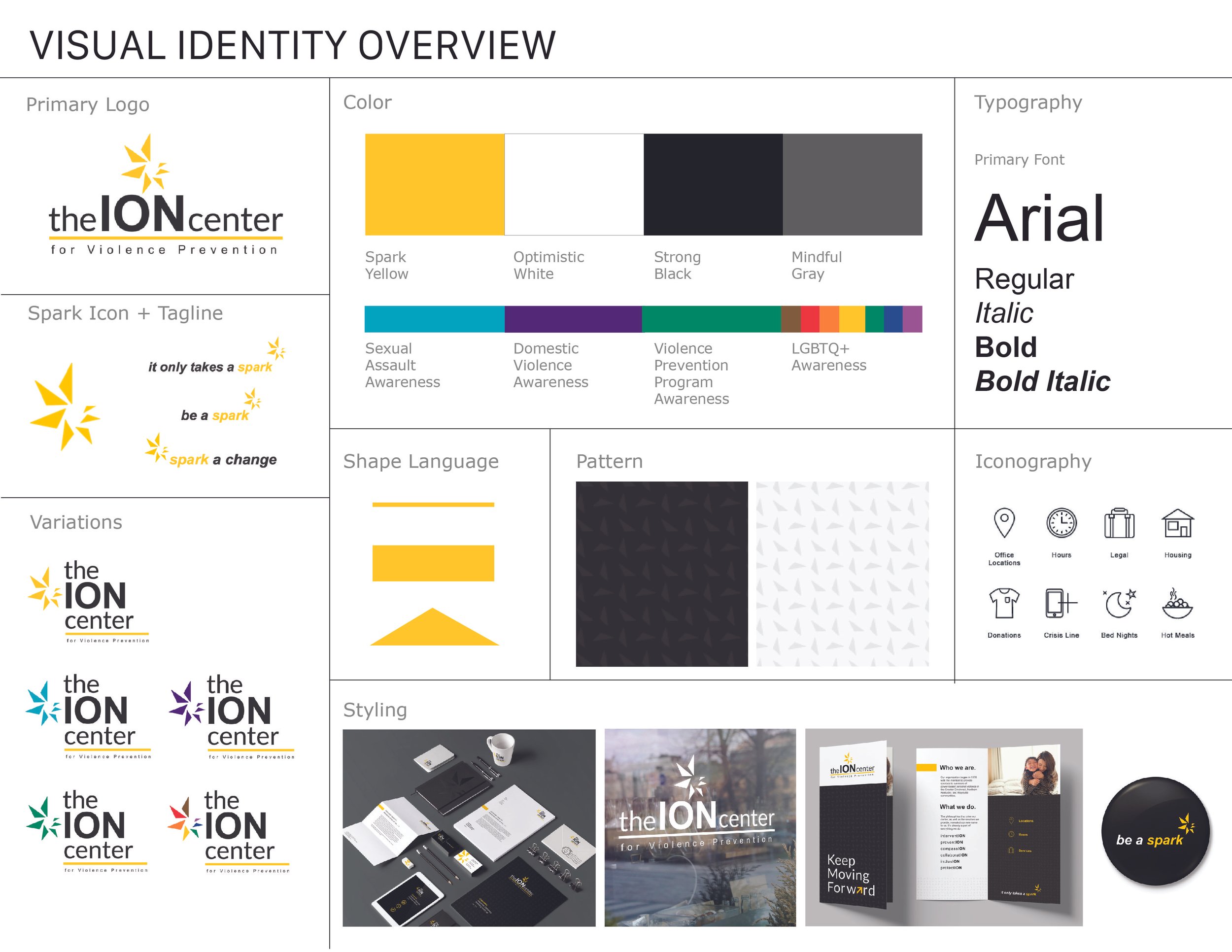
Color has a new role.

Spark Yellow
Bold, attention getting, uplifting, warm, positive, and inviting.
Used to signal a change is has happened or is happening.

Optimistic White
Safety, understanding, sincerity, inclusive.
Used to create a sense of space that is bright, hopeful and welcoming.

Strong Black
Protection, strength, and determination.
Used to add contrast and depth to the brands visual identity.

Mindful Grey
Neutral, practical, and diplomatic.
Used to symbolizes the diversity between the extremes or polar opposites.


Communication
During the brand building process we focused on communication pillars be anchors for the brand messaging. This process inspired messaging for the launch and beyond.


